Showing posts with label graphic design. Show all posts

Wednesday, May 30, 2012

my life in 10 weeks

I am wrapping up yet another quarter. I have just one more project to turn in before I have three weeks of break which include a trip to Miami! While you might not be able to tell from my blog I've actually been doing very well on my photo taking. As I browse through my last few weeks I find that you can tell that my life revolves around classes and projects because that is what a majority of my photos chronicle. I really like that I think to document some of the mundane moments and my process because it's such a large part of my life that it amuses me to have people "like" these photos when they're viewed out of context.

I thought I'd do a little round-up of my school-related photos from the previous 10 weeks.

1. A slide that make me chuckle from a speaker at the Design Ethos conference that SCAD hosted.  2. A bit of process for my 3D project.  3. My friend's extraordinary interview skills for her thesis project.  4. Some napkin sketching action during drinks with a friend.  5. Practicing printing transfer for my final packaging projects.  6. Fun vinyl stickers that I made for my 3D project.  7. Actual PB&J sandwiches that I made and packaged for my class to enjoy.  8. Final's weekend to-do list that I'm still in the process of completing.

Wednesday, March 14, 2012

Quaker – A typeface


This is probably my biggest design accomplishment to date, and it's only halfway done.

This quarter I took the course Typeface Design where I began work on my first typeface entitled Quaker. So far Quaker includes uppercase glyphs, numbers, and primary punctuation. I'll continue working on them next quarter and complete the full set.

It was inspired by a vintage canvas sugar bag that I saw in an antique store. The starting point was the A and during the design process it is one of the few forms that did not experience significant revisions.

I have a lot of process documentation for this project because I intend to show this in my 45 hour MFA review. Below is a video that shows the designing process for the original six key glyphs and the E. I have over 10,000 frames from the duration of the project so I have to find a way to display them without it becoming an hour long motion picture. I think it is safe to say that I would be the ONLY person interested in that.

Monday, March 12, 2012

reading wishlist

I looking forward to being able to read over my spring break without feeling guilty. My amazon shopping cart has exploded with books that I just can't quite bring myself to buy. This is partially due to the fact that I'm very angry at losing my amazon student status that got me free two day shipping but that is besides the point.

If anyone is feeling generous and would like to donate or gift me with any one of these puppies I would be extremely grateful! Congratulations-on-finishing-your-finals gift perhaps?? Oh wait, does that holiday not exist?

I might just have to reallocate my birthday funds from the previously mentioned dress into books. Now that's an interesting thought: 1 dress = 8 (used) books.

From top to bottom: Just My Type, Made by Hand: Searching for Meaning in a Throwaway World, The Night Circus, The Craftsman, A Love Letter For You, Shop Class as Soulcraft: An inquiry into the Value of Work, Cradle to Cradle, and How to be a Graphic Designer without Losing your Soul

All images from Amazon.

Tuesday, March 06, 2012

sign painting


The focus of my current research project for the Visual Culture course that I am currently taking is the current resurgence of hand painted signage. One of my primary cases studies that I have been using as an example is the company Colossal Media who have successfully established themselves as purveyors of hand painted outdoor media. Their work can be seen in several of the U.S.'s major markets and is (I believe) contributing to the medium's reemergence. Watch this video and you'll understand. One thing that I think has assisted in the public's* sudden interest is the focus on the process. The development of these works become an installation piece and we can very easily attach a face to the work being created. This skill straddles the line between the fine art and the graphic design, especially when used for advertisements like the work of Colossal Media. It is ironic that I compare this skill to the fine arts because historically and even contemporarily it is rare that those who possess this undeniable skill are considered "artists" in the traditional sense of the term,  instead labeled as craftsmen. This idea of a "craftsman" is also of great interest to me but that is a topic for another time. Primarily because I need to complete a lot more reading on that topic to fully form my opinion. But I digress. I feel that I have happened upon this subject at just the right time because many within my university community (and definitely outside of Savannah too, such as this, this, and this) are also thinking about it.

However, this is also somewhat unfortunate because I would always like to hope that my ideas are new and different but nay, they are not. This brings about another question, though maybe not question but proof, that you are indeed a product of your surroundings. While I don't think sign painting has become a sudden interest to me it has definitely become a new research interest and I wonder how much of that is affected by my surroundings. What have I seen, heard or been exposed to that nudged me in this direction?


*I say public but then quickly realize that as a graduate graphic design student my knowledge of "public" is very skewed. So let's consider this just my small corner of the public.

image from Colossal Media.

Monday, February 06, 2012

awesome video

What could it possibly be about...TYPE, of course!


The creator (Alessandro Novelli) even showcases the animation's process on his blog.

Friday, January 06, 2012

beautiful typography

This page caught my eye in a book I recently checked out from the library.
From Made with FontFont: Type for independent minds by Erik Spiekermann and Jan Middendorp.

Sunday, November 06, 2011

identity investigations

A project I am currently working on for one of my classes has caused me to be even more aware of well-designed identities lately. I've been obsessively pinning them and thought I'd share some of my favorites from the recent weeks.
Identity designed for The Chop Shop by Ptarmak.

I just can't get over the animal silhouettes. The Crunchy Grocer identity by
The Tenfold Collective.

I'm apparently really into geometric shapes lately. It's really become a sickness. I'm
especially drawn to the colors in ITI's identity by Heydays.

This kraft paper-happy identity for Eastfield Village is simple but stunning by
Hovard Design.

Lastly, you've got to appreciate a well-designed barber shop. The website for Fast Eddie's
is pretty great as well. Designed by Richard Arthur Stewart.
This is just a few of those that have caught my eye. See my pinterest boards for more examples.

Sunday, October 23, 2011

SPARKS gallery show

I made my Savannah gallery debut this past Friday in an exhibition featuring the work of my Design Methodologies course that I took over the summer. The show was a smashing success with a fantastic turnout and everyone was extremely encouraging regarding our work.

The entire group and our Professor.

My work.


Just a small sampling of our fantastic turnout!

Thursday, September 01, 2011

book bound

I am officially finished with my second quarter and have one more book under my belt! I made a process book chronicling my Design Methodology class and all the projects that were completed. 

Monday, August 29, 2011

i hope to one day be this talented

I came across this on design work life and am currently contemplating recording my screen at all times in hope that I may have something even half as cool one day. Here's hoping!

Poster Process - The Black Keys from DKNG Studios on Vimeo.

Awesome, right?

I doubt my past 22 hours (continuous, for the most part) of design work for one of my classes would have been worth recording. It would NOT have made for very riveting watching! It included quite a lot of pinterest searching in an effort to overcome my designer's block that has plagued me throughout this entire project!

Tuesday, August 09, 2011

book work

For my Typography course this quarter I had the opportunity to try my hand at bookbinding for the first time. It took me several attempts to get my stitch down for the style binding I ended up using but I am very happy with the result! Here's some quick photos of the finished product before I turn it in this evening.


Wednesday, August 03, 2011

chalkboard art

I've seen Dana Tanamachi's artwork all over the blogsphere (Design*Sponge today) and can't express my love enough! What's better then looking at chalkboard art? Seeing it made...

Stop motion video of Dana creating artwork for the Nagging Doubt wine label. See more videos and work here.

Thursday, July 21, 2011

i want these NOW

We had these growing up and I didn't appreciate them at the time but I'd love to be given a second chance! Just look at the options...

Letter Set Transfers from Veer

Saturday, February 19, 2011

chris ware's quimby the mouse

A few nights ago I had the pleasure of attending a talk by Chip Kidd and Chris Ware (I apologize for the awful cell phone photo). I was previously unaware of a majority of Chris Ware's work and didn't have any detailed knowledge of the little I was familiar with. I've been lucky enough to see, and hear, Chip Kidd speak previously and always find him enjoyable but Chris Ware really stole the show especially when he casually mentioned "his friend, Ira Glass." I am a huge This American Life fan and will even admit to having a large crush on Mr. Glass. It seems Chris Ware created an animated cartoon for the Live Event of This American Life a few years back.
Here's the video.
Quimby The Mouse from This American Life on Vimeo.

Wednesday, July 07, 2010

vintage letterheads


A fantastic collection of vintage and new letterheads. See more here.

Monday, May 24, 2010

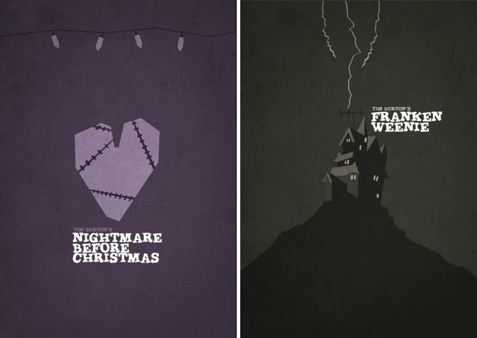
tim burton movie posters

I just adore Tim Burton, he can do no wrong in my book. These posters capture the dark but playful spirit of his films and I think they perfectly illustrate the notion that less really is more.


Found here.

Saturday, May 08, 2010

up there film

Check out this awe inspiring short film about the dying art of hand painted advertisements.